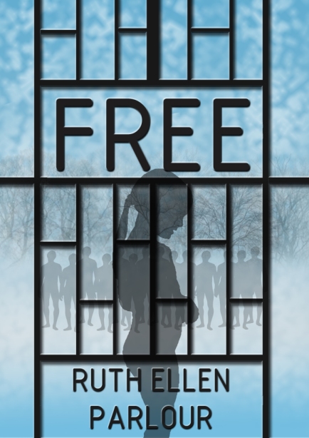
What do you think of this cover design? It’s for my short story ‘free’ which was originally called ‘Arbeit Macht Frei’ but because it was in German people couldn’t remember the title so I changed it. I thought the translation ‘Work will set you free’ wasn’t very good for a title so I just called it ‘free’ you can see the first book cover here and compare to two. I’d love to know what you think!
It’s a short story about a girl in a concentration camp. I’m going to be epublishing it for free as a what-might-go-wrong trail before I publish my novel. You can read a snippet of it here.


I like the juxtaposition of the heavy black gate (?) against the shadowy people and trees. I also like the way that you’ve incorporated the title so it looks like it’s part of the gate. Nice job 🙂
Thanks Clare! I modelled the gate on the one in Sachsenhausen which has ‘Arbeit Macht Frei’ in place of my ‘free’
Great cover, Ruth! I looked at the picture before I read the text above and immediately thought the story was about a girl in a concentration camp, so I think it’s a great choice for your story. 🙂
Thanks very much Sarah!
Ooh, very nice!
Thanks!
Great stuff, Ruth. A cover is simply supposed to convey the content, and I think yours does that excellently. Nice job!
Thanks! It’s certainly better than the last one I did for it 🙂