There’s a famous writing saying that gets banded around the internet:
It means that sometimes, no matter how much you love a scene, a character, or some other element, sometimes it has to be brutally cut from the book if it doesn’t have a purpose.
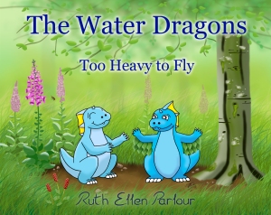
I spent a long time (quite a few days) designing a title for the front of the book. I had in mind what I wanted it to look like and I drew it using Photoshop. When I got some feedback for the book, the title I had designed was noted as not being appealing. I can take criticism no problem so I set to work on a new title and designed a few different styles that were fancier and eye catching.
When I got feedback on the new fonts, they were too fancy and detracted from the picture. I was advised to use a standard font. I felt like crying. Days of my lives went into making a nice font that kids might like. As a designer and artist it was hard for me to come round to the idea that a fancy font just didn’t do the job that a regular font did. I couldn’t deny that a standard font appeals to people’s eyes, it’s easily readable and most of all it does actually stand out!
So I uploaded a new cover with a bog standard font (the same that I used for the interior) even though I wasn’t really happy with the choice, I knew it was for the best.
What do you think? These were my designs, do you think I made the right choice in the end?
Thanks for reading! In my next article I’ll be asking your opinion on gender roles in kid’s books.


I love the last one. I also like the one where you arched Water Dragons but I like the “too heavy to fly” without the long tails on the letters like you have in the last one, but I can see where kids might like the standard, plain. go with your gut. Which one is your fave?
Thanks for commenting Jenny 🙂
Personally I like the arched one without the tails. I think it frames the image nicely. The plain text just looks more professional. But the good thing about self-pub is that I can always change it later if I want 🙂